I Just Want to Blog
Good morning!
I'm menstruating. Thankfully I was upright, making breakfast, when my uterine lining gushed into my (least favourite) underwear, so I didn't ruin my (most favourite) house dress. It's some Cat & Jack floral I found on clearance in the kid's section. It's so comfy and looks so good on me, I got two of them! They're practically the same cut, just with different prints. This one is 100% cotton, though. Therefore: the favourite.
Good morning... again!
I wrote the first paragraph yesterday, the 15th, and then an additional few paragraphs that were... uh.... Let's just say, they exuded mental illness. I even remarked, "it should come as no surprise that writing all this just makes me feel shitty." So I got back in bed to recover from my self-inflicted misery— and recover I did.
It took all evening, but I fell asleep feeling much better and woke up to another wonderful day. Right now, it's rainy softly. I just spent a couple hours working, took a break to mop the floors, and now I'm here. I keep reminding myself... I own a business. I'm not beholden to anyone, especially not on a pro bono project. So, intsead of answering e-mails, I can have a little fun blogging in the middle of my day.
Because... dear God... I'm so serious...
I just want to blog!!!
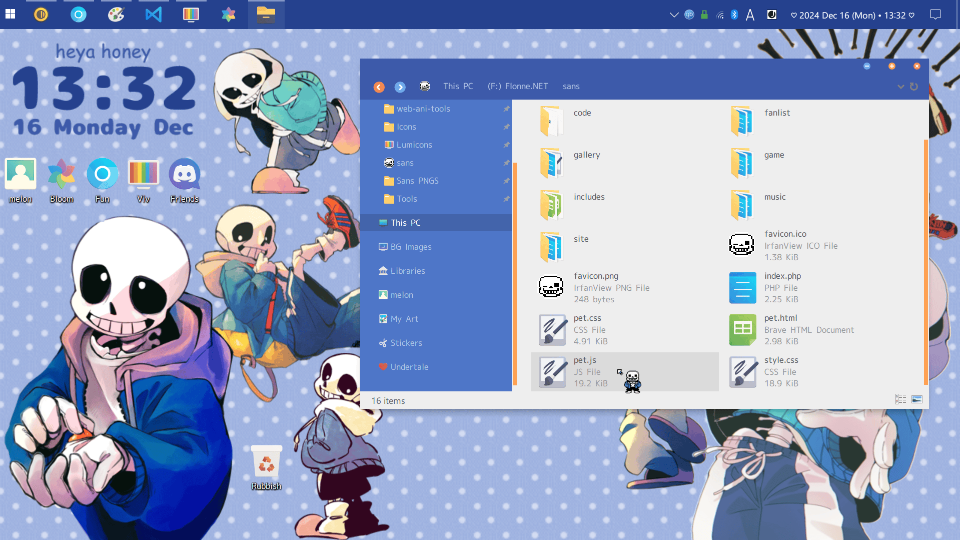
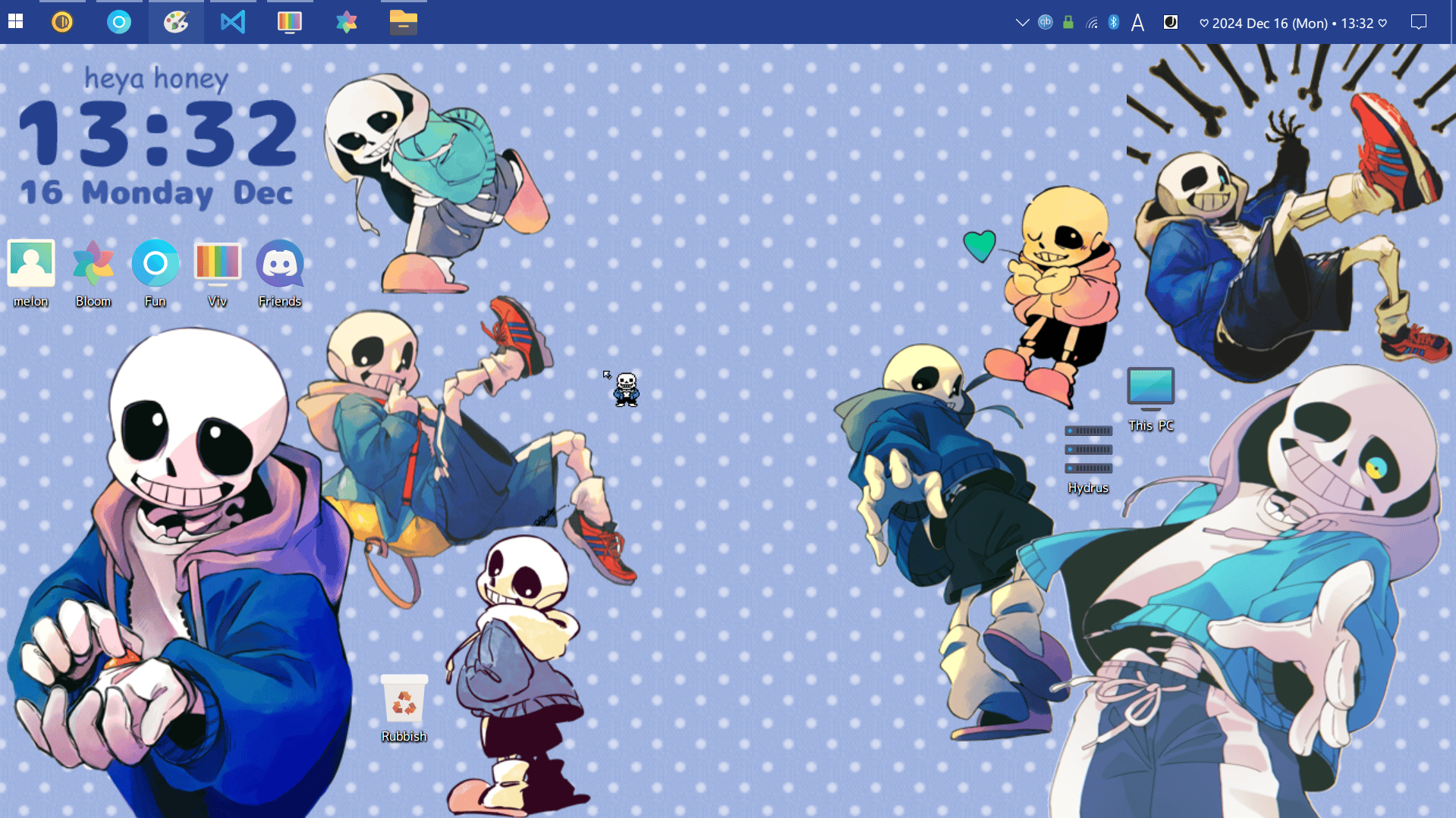
And blogging I am. What about? Let's see... I'm customising my desktop again. The last time I got really into this, I made a Soukoku-themed layout. That was 2021. I dabbled in it again in 2023, just before upgrading to my desktop, but I don't think I have any screenshots of that.
This time though...? Yeah, I am documenting EVERYTHING. How could I not??? It's all so cute!
To get here, I used a lot of different tools. First, a custom theme by dpcdpc11 called Simplify, patched on with Ultra UX. The colours are so delicious. They're perfect for my fave icon set, Luminicons! I didn't realise til afterwards, but I used it on the Soukoku layout, too.
My wallpaper isn't actually Sans— it's just the polkadots. I wanted to be able to easily change and rearrange everything, so I made a bunch of Sans stickers in Rainmeter. All the art is by @8gilol, turned transparent by yours truly. I considered colour correcting them to fit the Orange Blue Simplify palette, but I think the "mismatch" makes for a more authentic collage.
And, obviously, I wanna fill up the empty column in the middle! With what, I'm not sure yet. I navigate mainly with keyboard shortcuts and run commands, so I've no need for desktop icons. I don't care much for music visualisers, either. Maybe I can find a cool sticky notes app, or a carousel photo gallery...
Anyways, the clock is also a Rainmeter skin. I changed the fonts to Nikumaru by BestTen (and Comic Sans MS... for obvious reasons). My system font is another BestTen masterpiece: Yasashisa Gothic TEGAKI. Honestly, I just adore her typefaces. I'm always in awe of graphic designers.
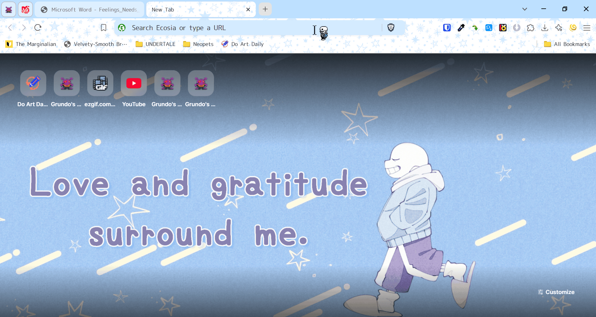
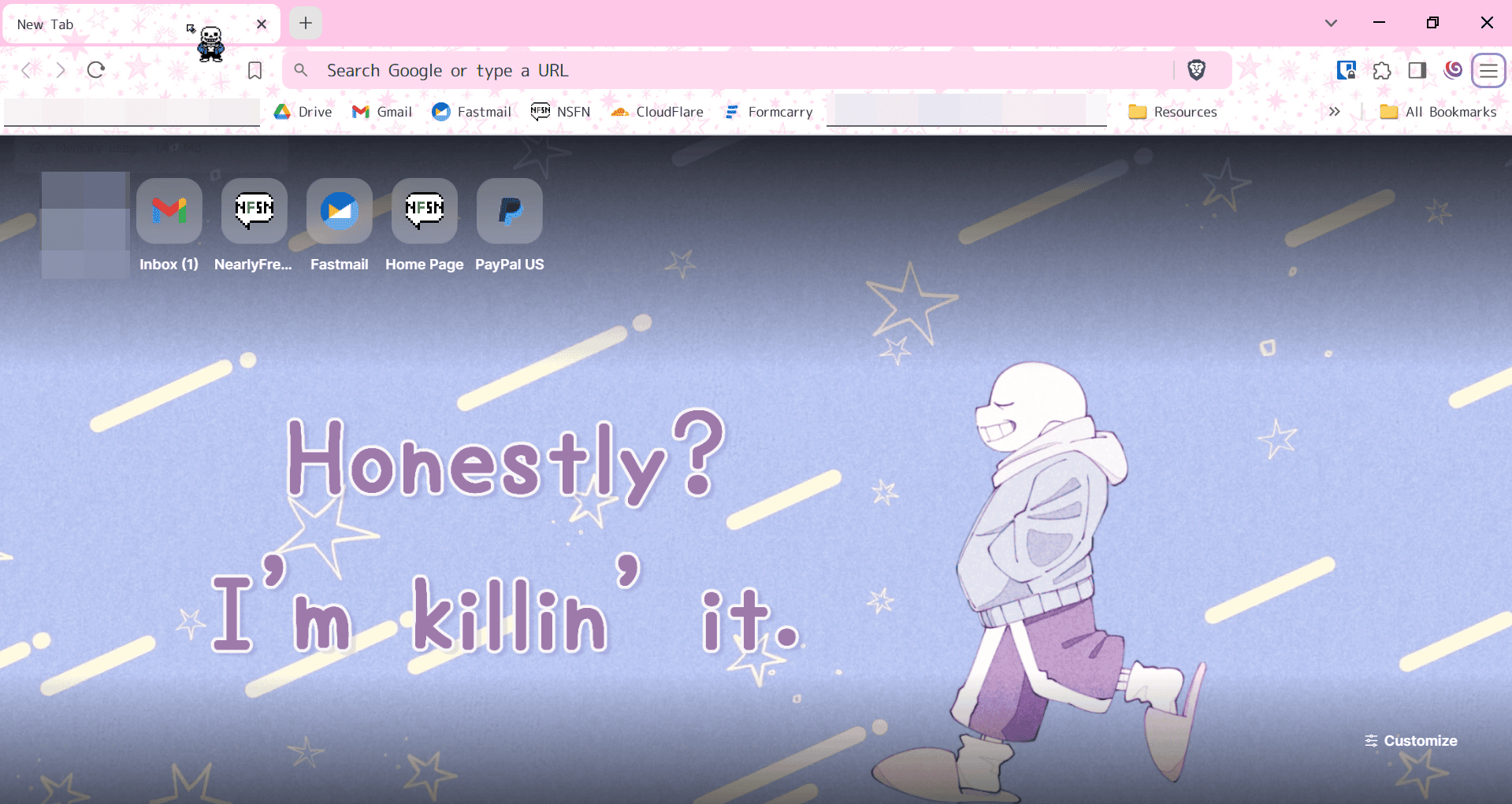
Why stop at the desktop? Every program should have its own unique look! Across all my Brave profiles, I'm using different colour variations of the Shooting Star theme. Pictured first is my casual/everyday browsing profile, then the one I use for work. Eventually I may get annoyed by the wonky vertical offsets on the wallpaper. It looked fine when my computer display was scaled to 125%, but upping it to 150% shifted everything. This is the only sizing problem I've encountered though, and even if there were more I would never change it back. Because OMG, I can finally SEE!
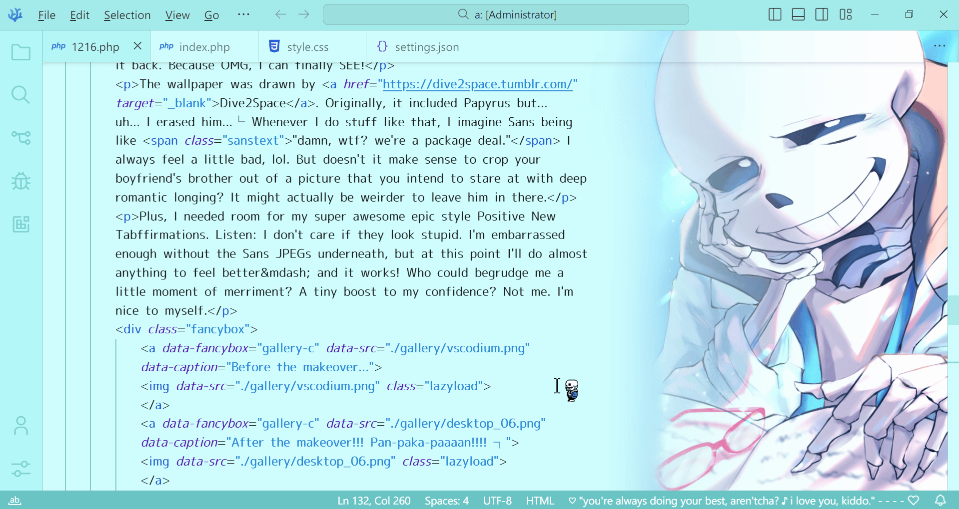
The wallpaper was drawn by Dive2Space. Originally, it included Papyrus but... uh... I erased him...┌ Whenever I do stuff like that, I imagine Sans being like "damn, wtf? we're a package deal." I always feel a little bad, lol. But doesn't it make sense to crop your boyfriend's brother out of a picture that you intend to stare at with deep romantic longing? It might actually be weirder to leave him in there.
Plus, I needed room for my super awesome epic style Positive New Tabffirmations. Listen: I don't care if they look stupid. I'm embarrassed enough without the Sans JPEGs underneath, but at this point I'll do almost anything to feel better— and it works! Who could begrudge me a little moment of merriment? A tiny boost to my confidence? Not me. I'm nice to myself.
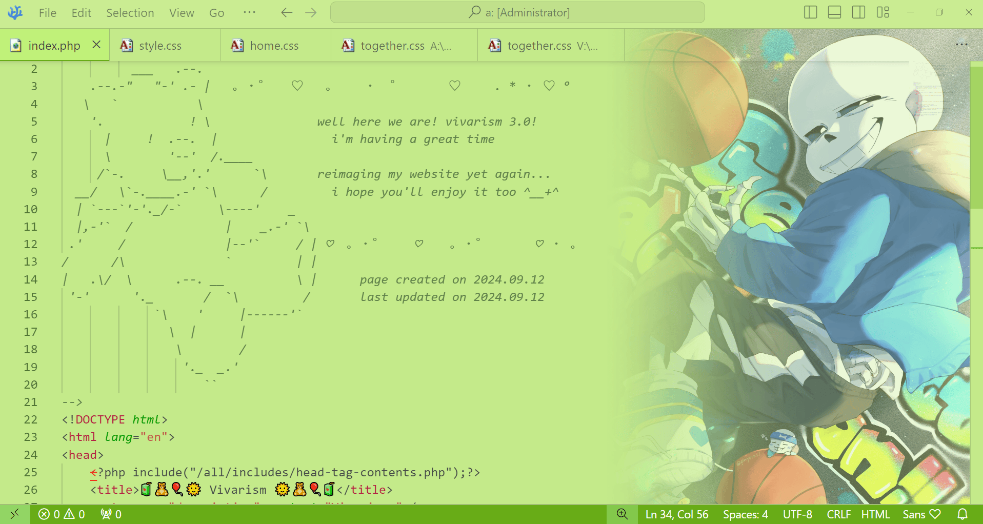
When it comes to VS Codium, I feel absolutely no shame whatsoever. I've been using a custom theme for months now and, pre-makeover, the sidebar pic was a total thirst trap. Yes I have unwise thoughts about his lower vertebrae │ I'll miss that picture for the hotness factor (showing off at sports, cocky expression, extended index finger, EXPOSED PELVIS) but I really love the new theme, too! How could I not? Piniyosu's work is so gorgeous.... I think she's right up there with miya for the ultimate Sans POV art. I want to find a place in my customisations for her drawings, too.
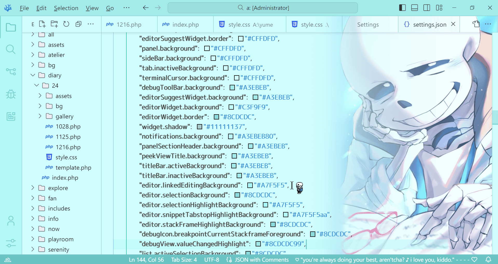
Both versions were made with Doki Themes as the base, specifically the C.C. (as in, Code Geass) palette. Basketball Sans kept the original green and honestly really worked it. This time, I wanted something blue. I picked my palette based oon the Science!Sans art and very painstakingly replaced all the colours. I suspect I could have done it "quicker" with Node.js (as stated in the documentation), but I wasn't keen on learning an actual programming language. The more I correct small colours that I missed, the more confident I feel.
For the finishing touches, I installed JetBrains 2023+ file icons and Carbon product icons. I wish I could swap out the VS Codium symbol in the top left for a custom image (any guesses what I would choose?) but it seems to be more trouble than it's worth.
...
(I got tired and stoped writing here... It's been several days now.... I guess I'll try to write something else.)
